Creating “real” subplots in SimBiology using the Plot Type Library
The SimBiology Desktop offers a number of different plot types that can
be chosen in a task window. The default plot type in a simulation task,
for example, is the Time plot, which plots states against the
simulation time:
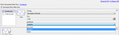
Three items need to be configured for this plot type:
tobj(which we will learn about later)y(used to specify which states to plot)- and
plotStyle, eitherone axes,subplotortrellis
The subplotoption often confuses people – and I was one of them when
I started with SimBiology. Many (including myself) intuitively expect
this option to allow plotting of each state in its own plot axes, i.e.,
in its own subplot. However, this option is used to plot the results
of several simulations (from a scan or ensemble simulation) into
individual subplots. How could we plot each state in a separate
subplot?
A possible solution is to add a user-defined plot to the Plot Type
Library. This library can be accessed from the address bar:
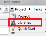
In the Plot Types Library window, a list of the available Plot Types and
the associated code can be found. The easiest to get started is to
copy-paste one of the existing Plot Types and modify the copied code.
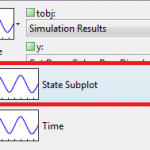
However, here I will start with a blank new Plot Type. Let’s add a new
Plot Type called State Subplot:
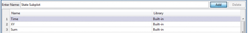
Clicking on Add will automatically create a template that we can extend to create our own Plot Type:
function State_Subplot(tobj)
Let’s add a second argument containing the names of the states that we want to plot:
function State_Subplot(tobj, y)
Below the editor is a box where the arguments that should be passed into
this plotting function need to be defined. The second argument y has
already been added to this table
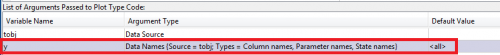
These are the parameters that will later on need to be specified in the
task window. There’s a choice of six argument types, the most important
one for our purposes are Data Source, Data Names and Enumerations.
Data Source contains the results of the simulation in the form of a
SimData object or a Dataset array in the case of external data
(after these have been imported into the Data Tab). tobj is already
predefined as a Data Source; we will choose Data Names as the
Argument Type for y with the default value set to <all>.
Enumerations can be used to provide a drop-down list of string
alternatives. As an example for their use, the Time plot type uses
enumerations to provide the PlotStyle dialog to distinguish between
one axes, subplot and trellis.
Now everything is set up and the remaining task is to code the subplot
itself.
First, we will extract the simulation data from the SimData object
tobj
% Get Data to be plotted
if strcmpi(y, '<all>')
    [time, data, names] = getdata(tobj);
else
    [time, data, names] = selectbyname(tobj, y);
end
We need to distinguish between the default option and a list of state
names. selectbyname() can be used to extract simulation data for a
limited number of states; getdata() can be used to separate all data
into double arrays and a cell array, so that they can be easily plotted
using the generic plot() command.
In the next step we need to figure out the number of rows and columns for the subplot. First, we’ll calculate the square root of the number of states to be plotted
rootnplots = sqrt(numel(names));
and then – considering that monitors typically have a 4:3 or 16:9 aspect ratio – set up the number of rows and columns so that we have more columns than rows
nrows = round(rootnplots);
ncolumns = ceil(rootnplots);
Finally, the last remaining task is to create the actual plot
for(i = 1:numel(names))
    subplot(nrows,ncolumns,i)
    plot(time, data(:,i));
    title(names(i),'Interpreter','none');
end
We step through each state using a for loop, create a new subplot
axis, plot the state values against time and put the name of the state
as a title, switching off LaTeX interpretation of the title string so
that underscores, for example, are not interpreted in the LaTeX way as a
subscript. Axis labels and other things could also be set here. Done.
Last, you might want to share your newly created plot type with one of
your colleagues. For this, click on the action button left of the
address bar
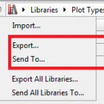
and either export the plot type or send it as an email attachment
directly from SimBiology. Your colleague can import the new plot type by
importing the .plottype file from the same dialog. After this import,
the new plot type is available from the plot list in the task window
Any comments/questions? Send me an email.