Julia for MATLAB users II
In the last posts I installed julia, some graphics packages and some dependencies on a Mac and compared one way of plotting in julia - using Winston and plotting several datasets into one plot - with the typical approach in MATLAB. This post will show how to plot each individual dataset into its own plot (subplot in MATLAB).
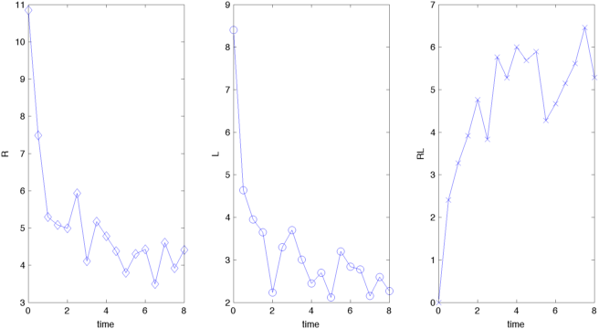
The data that I'll be using has been imported into individual vectors using csvread and readdlm in MATLAB and julia, respectively. Plotting this into different plots requires subplot in MATLAB
figure('Position',[350 350 800 400])
% tiled plot or subplot
subplot(1,3,1),plot(t,R,'-bd','MarkerSize',8); xlabel('time'),ylabel('R')
subplot(1,3,2),plot(t,L,'-bo','MarkerSize',8); xlabel('time'),ylabel('L')
subplot(1,3,3),plot(t,RL,'-bx','MarkerSize',8); xlabel('time'),ylabel('RL')

export_fig('matlab_rlbinding_subplot.png','-png', '-r72','-transparent')
resulting in the following plot:
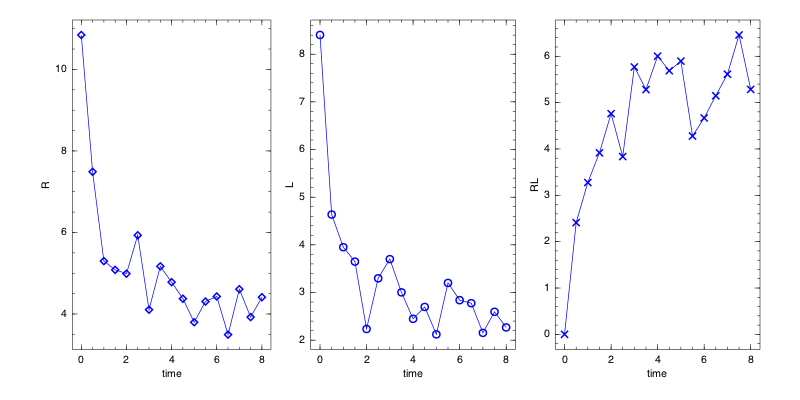
Creating a similar plot in julia is again a bit more complicated. In Winston a combination of FramedPlot and Table is needed
# first create the individual plot containers
p1=FramedPlot("xlabel","time","ylabel","R")
p2=FramedPlot("xlabel","time","ylabel","L")
p3=FramedPlot("xlabel","time","ylabel","RL")

# add the different plot types to the containers
# first points
add(p1,Points(time,R,"type","diamond", "color","blue"))
add(p2,Points(time,L,"type","circle", "color","blue"))
add(p3,Points(time,RL,"type","cross", "color","blue"))

# then line plots
add(p1,Curve(time,R, "color","blue"))
add(p2,Curve(time,L, "color","blue"))
add(p3,Curve(time,RL, "color","blue"))

# finally, create a Table with 1 row and 3 columns
t = Table(1,3)
# and add the different FramedPlot
# containers to the Table elements
# (which is somewhat similar in style to MATLAB subplots)
t[1,1] = p1
t[1,2] = p2
t[1,3] = p3

# The figure width and height can be
# changed when creating the graphics file
file(t,"julia_rlbinding_subplot.png","width",800,"height",400)
The final plot looks like this
One issue with creating Winston plots is that some of the functions are still not very well documented. Sometimes it seems to be necessary to look at the source code to see additional options. For example, only the source code explicitly mentions "width" and "height" as arguments to the file function.
To me, the default plot attributes create a much better looking plot in julia/Winston than in MATLAB. The plots look sharper in julia than in MATLAB, apparently the default line widths are larger in julia. Obviously, both plots could be much improved by tweaking the options, but I wanted to keep the plots simple and with as little code as possible to be able to fairly compare the results.
Any comments/questions? Send me an email.