Julia for MATLAB users III
Previous articles explored julia and its plotting facilities in the Winston package. The workflow used there, (i) data import, (ii) plotting and (iii) graphics export, will be used in this article as well, however, this time using Dataframes and Gadfly in julia and dataset arrays in MATLAB.
Dataset arrays are a rather new and unknown addition to MATLAB, mostly because they were only available in the statistics toolbox (up until release R2013b when table was added as a new datatype to core MATLAB).
% create a dataset array with similar properties to
% DataFrames in R or Python
data = dataset('File','rlbinding.csv',...
'Delimiter',',','ReadVarNames',false)
% rename the column headers
data.Properties.VarNames = {'time','R','L','RL'}
% unfortunately, dataset arrays are
% not really an integrated part of matlab
% hence plotting needs to be done as before
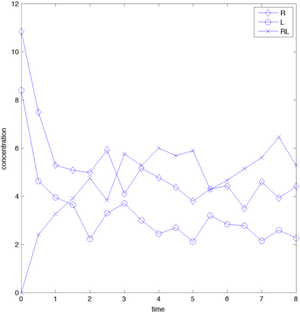
figure('Position',[350 350 800 400])
plot(t,R,'-bd',t,L,'-bo',t,RL,'-bx','MarkerSize',8)
legend({'R','L','RL'})
xlabel('time')
ylabel('concentration')
export_fig('matlab_rlbinding.png',...
'-png', '-r72','-transparent')
creating the same plot as before:
The only difference to plotting it using standard arrays are the slightly different input arguments - you basically have to extract the data first from the dataset array into a double array before plotting it. See the previous article for how to do this.
Using julia for this is quite illustrative (and a really nice experience). You will need to install the DataFrames and Gadfly packages, though the former (as well as a bunch of other dependencies) should be automatically installed when installing Gadfly. Gadfly follows a completely different philosophy from MATLAB and Winston and is strongly influenced by ggplot in R. I struggled creating a plot overlaying several matrix columns, however, that was mostly due to my misconception of how Gadfly should work. In the end I created a stacked data set where time series data are stacked on top of each other and then grouped by reading in the original data and then shuffling columns around.
using Gadfly
using DataFrames
# get the file names in the current folder
files = readdir()
# read the data into dataframe - named
# function arguments, yeah!
data = readtable(files[2],separator=',',header=false)
# rename the column headers - ! at the
# end of function names indicates that
# the inputs will be modified by the function (though
# this is only based on mutual agreement, not an
# in-built language feature)
colnames!(data,["time","R","L","RL"])
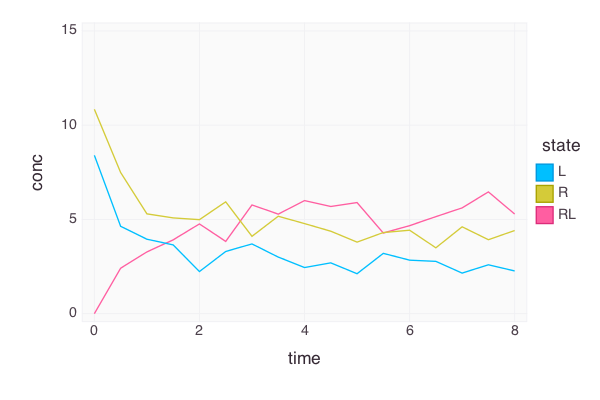
Let's transform the data so that it conforms with Gadfly's way of thinking
sdata = DataFrame() # empty data frame
t = data["time"] # one-dimensional vectors!
ntime = size(t)
sdata["time"] = [t, t, t] # stack time vectors
sdata["conc"] = [data["R"], data["L"], data["RL"]] # stack data
# create a grouping variable
sdata["state"] = [fill("R", ntime), fill("L", ntime), fill("RL", ntime)]
Now the data is imported and easily accessible; the next step is to do the actual plotting using the Gadfly package. In contrast to MATLAB, DataFrames are the building blocks of Gadfly.
# Gadfly expects a data frame as the first input argument
# then a mapping of axes to columns and the type of plot to display
p = plot(sdata, x="time", y="conc", color="state",Geom.line)
fname = "rlbinding_gadfly.png" # the name of the final file
# draw to the PNG backbone (or use SVG, D3,...)
draw(PNG(fname, 600px, 400px), p)
You can display this directly in the ijulia notebook interface when you are using the D3 drawing backbone instead of PNG. However,
if you are using the REPL that comes with julia, you can only save the figure, not display it. Here the backtick notation for running shell programs adopted from perl and others comes in handy - simply run open in the terminal on the plot file
run(`open $fname`) # variables can be referenced using `$`
and the application associated with the file type will open on a Mac. Great stuff.
The final plot looks good - but customization seems to be sorely lacking as of now.
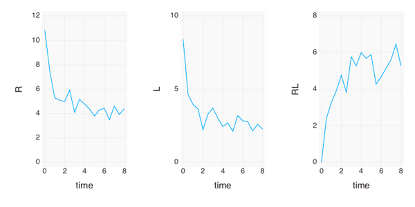
Let's try the subplot approach and plot the different states in horizontally stacked plots,
hfname="rlbinding_gadfly_subplot.png"
# use hstack for horizontally stacking plots,
# vstack for vertical stacks
hp = hstack(plot(data, x="time", y="R",Geom.line), plot(data,x="time",y="L",Geom.line), plot(data,x="time",y="RL",Geom.line))
draw(PNG(hfname, 600px, 300px), hp)
run(`open $hfname`)
which creates another great-looking plot
Any comments/questions? Send me an email.